

Snapchat: Team Snapchat
2019
Snapchat
Summer 2019 was an exciting time for Snapchat’s in-house marketing department, as the brand geared up to reveal a refreshed logo and brand identity, as well as the brand’s first ever out of home campaign, “Real Friends”. I lead the rebrand of Team Snapchat, Snapchat’s own account that it uses for new user onboarding content, new release announcements, product tutorials, and cultural celebrations. My team established a new identity for the account, as well as clear and thorough guidelines on how to design and produce content for it. I directed the design and the first 10 Mass Snaps that went live from the new Team Snapchat.
We built Team Snapchat with seven different brand components, as well as an appendix manual for production and localization into 41 languages. Those seven parts were Context, Visual Overview, Typography, Color, Composition, Motion, and Tone of Voice.
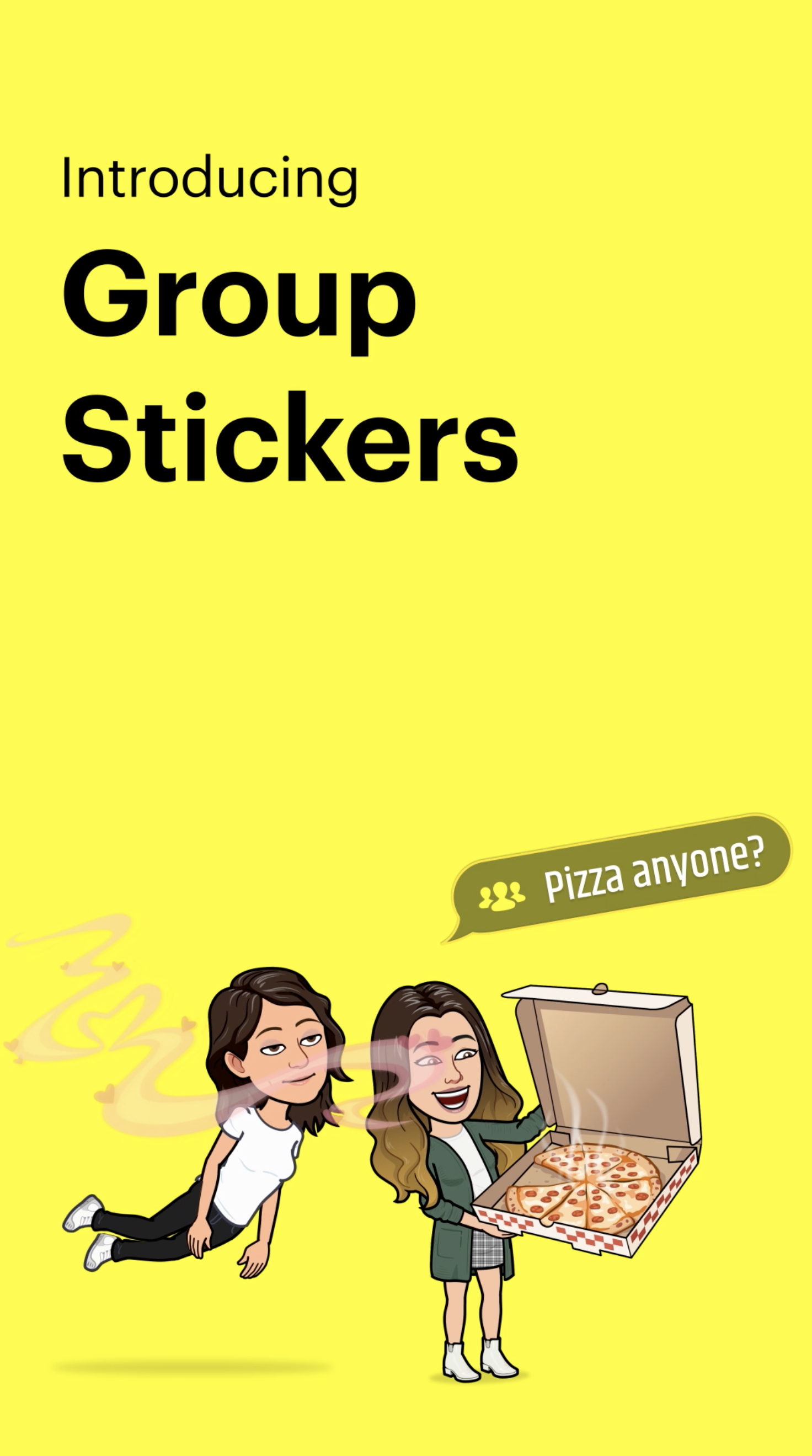
New User Onboarding and New Product Release Videos


Context

Visual
Elements
The Rebrand
It was important to understand where Team Snapchat content lived in Snapchat’s larger bucket of growth-related content. Mass Snaps live at the end of a new user’s journey, as seen above. They are served to registered users in the app based off of patterns of use, location, and important dates in the year. Team Snapchat content serves three main purposes - Educate the user on the product, Engage users in cultural moments, and Empower users to share their own moments on the platform.
Team Snapchat content exists globally, commonly translated into 41 languages, and is viewed on a variety of devices with different connectivity levels.
We designed all content in a 16:9 aspect ratio, the most common device ratio across Apple and Android, and capped their length at 15 seconds. Being mindful of markets with 3G connections, we kept the drive action within the first 0 - 3 seconds of the video.

Understanding the elements we had to work with laid the ground for the visual toolkit and how to properly use those tools. We divided visual elements into four buckets - Bitmojis, live action AV, miscellaneous screens, and UI graphics, From there, we were able to establish use cases for each category. All visual elements should cohesively tell a narrative, and be intentionally purposed.


Typography
For important text such as covers, titling, tooltips, and CTA’s, typography needed to be clear and legible with the ability to be localized. Right before this project kicked off, Snapchat had recently acquired a new consumer-facing brand typeface, the Graphik family. But with few rules on exactly how to implement type treatments, there was a lot to explore at first.


Titling
Envisioning a few different visual scenarios, we came up with three methods of titling - one that leverages new and/or unfamiliar looking UI, such as new buttons or icons, a titling system that showcases multiple ways of performing an action, and one that doubled as easily accessible (for those who may be visually impaired) as well as easily localizable.

Tooltips
Tooltips appeared as videos played with tap-by-tap instructions, also used a combination of Graphik Regular and Graphik Semibold to increase visibility and highlight key features. it is, the way you tell your story online can make all the difference.
Color
The use of a strict color system is how Snapchat continually individuates away from other platforms. Despite doing an exploration in expanding Team Snapchat beyond Snapchat’s iconic and unmissable yellow, we decided against introducing any new colors into the brand’s atmosphere. We continued with a simple palette of Snap Yellow, black, and white.
Original Exploration….

Where We Landed…

Composition
Composition is a key way we can create a memorable structure for Team Snapchat content. When designing compositions, including what covers looked like, how the device was sized in frame, and the balance and proportion of elements, keeping it simple was imperative - a less is more approach actually allowed for more creativity in creating fun and delightful introduction graphics.
Original Exploration

Spacing and Balance
Ensuring there was enough negative space between visual elements was critical. The goal was to avoid superfluous designs so that the narrative can really shine through.

End Cards
Instead of the traditional Snapchat ghost overlaid across different colors and imagery, the ghost now was the container that held the contextual imagery.

Animation
Motion and editing dictated the pace and legibility of Mass Snaps, especially in product tutorials, where we sometimes had a short time frame to explain a lot of information. Determining and timing and pacing of animating type, Bitscenes, user gestures were key to how information was interpreted by the user.

Copy &
Tone of Voice
Snapchat has long prided itself on its close connection to its user base, interacting with Snapchatters, listening to feedback, and making as easy and intuitive to share moments with their Real Friends. Determining tone of voice through copy was critical for how we continued those connections to the community. We worked extensively with a team of very talented copy writers with a deep understanding of Snap’s value system to establish branded vernacular, messaging pillars with detailed guidelines for each one, as well as samples of example copy for reference.

Voice in Action

The final product was a 60 page brand guidelines document, including an appendix with production, localization, and press asset guidelines, and was circulated company-wide throughout the marketing team divisions. These guidelines are still in effect and continue to evolve with Snap’s expanding brand refresh.